
How To Cook -
Responsive Website
Website Revamp Project
How to cook is an organisation focus on healthy food. The organisation needs a tool that helps people learn about how to cook and manage their eating habits. How to cook’s primary target concerned with the amount of obesity people and would like to learn ore about what they can help with the medical parties.
Project Type
Personal Project
My Role
Product Designer
UX Researcher
Timeline
May 2022 - Jul 2022
Tools
Adobe XD, Illustrator
Project Overview
The Problem
According to the Population Health Survey (PHS) conducted by the Department of Health, 29.9% (24.4% of females and 36.0% of males) of persons aged 15-84 were obese Obesity was most common among females aged 65-84 and among males aged 45-54. The strategy team at How To Cook would like to provide some balanced diet recipe which is the proven ways to let people achieve and maintain an ideal body weight.
The Goal
Design an app that will improve education on the topic of cooking healthy food and help people manage their weight.
My role
UX designer leading the app and responsive website design from conception to delivery
Responsibilities
Conducting interviews, paper and digital wireframing low and high-fidelity prototyping, conducting usability studies, accounting for accessibility, iterating on designs, determining information architecture, and responsive design.

User research: Summary
I used How To Cook’s data on healthy food to develop interview questions, which were then used to conduct user interviews. Most interview participants reported feeling guilty about eating yummy food, but they didn’t have much time to cook or don’t know how to cook. The feedback received through research made it very clear that users would be open and willing to cook themselves if they had access to an east-to cook tool to help guide them.

Persona 1 - Dorothy Fulton
Problem statement:
Dorothy is a secondary school teacher who needs suggestions and market place to cook more often with fresh ingredients because she want to save more money and eat healthier.

Persona 2 - Mercedes Brewer
Problem statement:
Mercedes is a PE student who needs new recipes that make tasty, easily to cook because most of the food he cook is not yummy enough that he lack of knowledge of cooking.
Pain points
1. Experiece
Students will take a lot of notes during lessons. Managing those notes can become very difficult if one is not careful and very organised.
2. Interaction
Existing websites make item selection difficult, which sometimes leads users to make mistakes
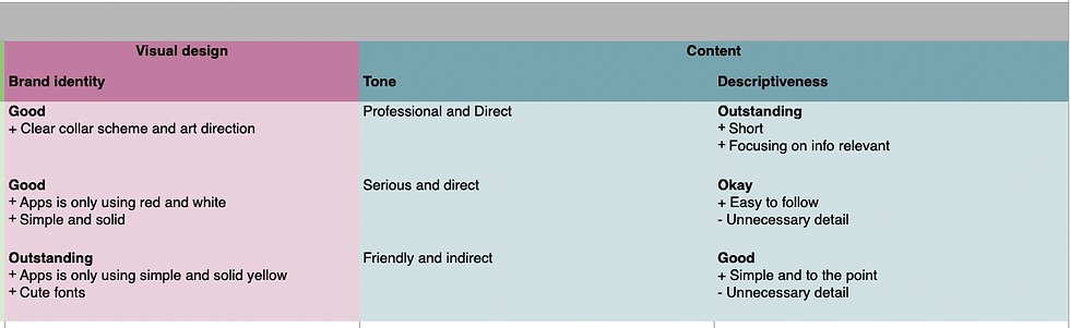
Competitive audit
An audit of a few competitor’s products provided direction on gaps and opportunities to address with the How to Cook website.


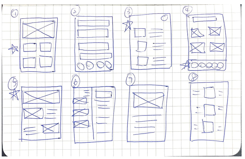
Concept Sketches
I did a quick ideation exercise to come up with ideas for how to address gaps identified in the competitive audit. My focus was specially on saving recipe to special for member.
Paper wireframes
Digital wireframe screen size variation(s)
Lo-Fi Wireframes
After ideating and drafting some paper wireframes, I created the initial design for HOW TO COOK app. These designs focused on delivering to users to help manage their recipe and save to favourite.
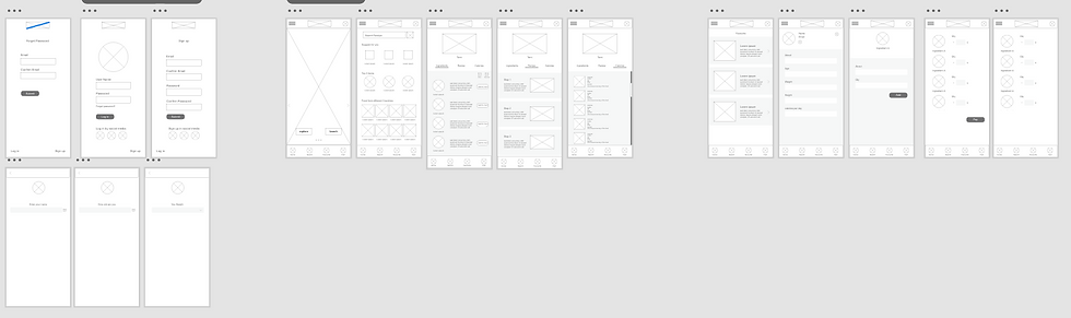


Based on the insight from usability studies, I applied design changes like providing a bigger photo of the popular recipe to attract user and let them get a better experience to get into search.

Additional design changes included adding more ingredient to the list and providing a clearer indication of how many ingredient on user’s list.


Accessibility considerations
1.
Clear menu and homepage with interactive elements that can attract users
2.
Initial focus of the home screen on personalised recommended to help define the primary task or action
3.
A better login page and personalised data for user to input, and recommend the recipe they may need.

Sitemap
With the app designs completed, I started work on designing the designing the responsive website, I used the HOW TO COOK site map to guide the organisational structure of each screens design to ensure a cohesive and consistent experience across devices.
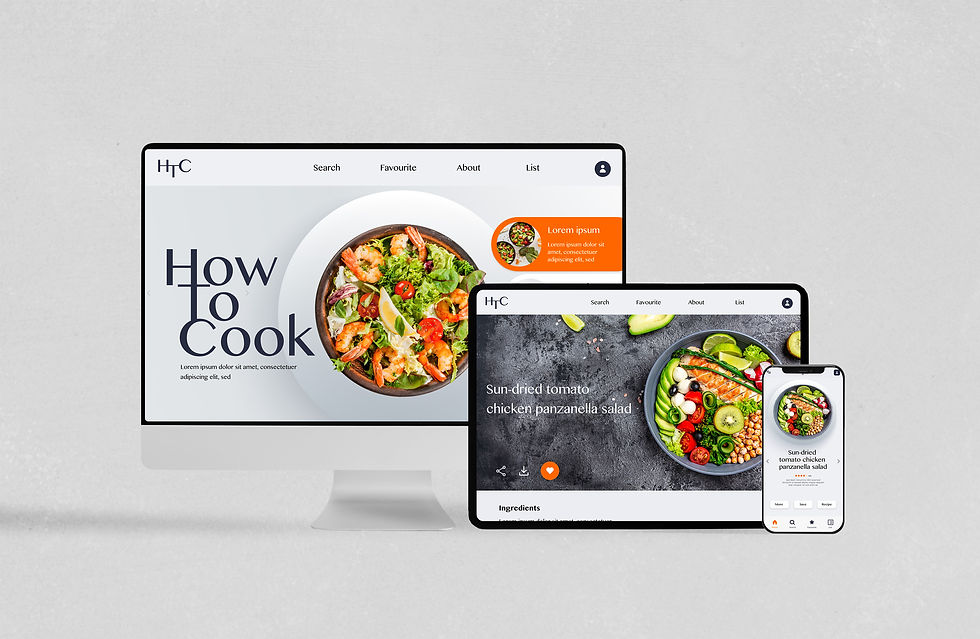
The design for screen size variation included mobile, tablet and desktop. I optimised the designs to fit specific user needs of each device and screen size.
